Published On Nov 23, 2017
Why Designers Should Strive To Make Designs Simpler vs. More "Interesting". Make your logo simpler, more legible and timeless vs. trying to be clever. The best logos in the world are often the simplest: Nike, Apple, Google, B&O, Levi's, FedEx, CBS, UPS, Warner, Girl Scouts, ABC, United Airlines, American Airlines, and IBM to name a few. They often use very common typefaces like Helvetica or Futura and refrain from over embellishment. Still don't believe us? Look at some of the most expensive luxury brands and study their logo.
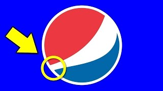
In his newest book, Blair Enns talks about the value of logo design isn't based on hours worked, or even the perceived quality of the design. To illustrate the point, he states, the Nike logo was designed for $100 while the Pepsi logo was $1 million. Is the million dollar logo better than the $100 logo? Is it worth 100,000 times more?
Designers often mistake the effort or cleverness of a logo as the hallmark of value. It is not. Furthermore, Michael Bierut says too much is made of a logo. A logo is only a very small aspect of the brand. It's not the whole story just the opening paragraph of a long story.
Jijibaba logo designed by Astrid Starvo, Atlas
http://www.astridstavro.com
This is the Futur of Education— Disrupting the design education paradigm.
Want a deeper dive? Typography, Lettering, Sales & Marketing, Social Media and The Business of Design courses available here:
https://goo.gl/bRt5qd
—
🚀 Futur Accelerator
The step-by-step blueprint and coaching program designed to get your creative business off the ground:
https://thefutur.com/accelerator
🥇 Futur Pro
The professional creative community designed to grow your personal brand, your business, and your network:
https://thefutur.com/pro
✍️ Other Courses, Templates, and Tools:
https://thefutur.com/shop
🎙 The Futur Podcast:
https://thefutur.com/podcast
Recommended books, tools, music, resources, typefaces & more:
https://thefutur.com/recommendations
Music by Epidemic Sound:
http://share.epidemicsound.com/thefutur
Shorts Playlist:
https://www.youtube.com/@thefutur/shorts
We love getting your letters. Send them here:
The Futur c/o Chris Do
1702 Olympic Blvd.
Santa Monica, CA 90404
*By making a purchase through any of our affiliate links, we receive a very small commission at no extra cost to you. This helps us on our mission to provide quality education to you. Thank you.
—
Credits:
Executive Producer– Chris Do
Host– Chris Do
Director– Erica Pead
Cinematography– Aaron Szekely, Mark Contreras
Editor– Stewart Schuster, Erica Pead
Futur Theme Music – Adam Sanborne http://www.adamsanborne.com
Annotations– Isaiah Nwukor
Typefaces: Futura, Din, Helvetica Neue
Futur theme song— Adam Sanborne
===
*By making a purchase through any of our affiliate links, we receive a very small commission at no extra cost to you. This helps us on our mission to provide quality education to you. Thank you.