Published On Apr 23, 2024
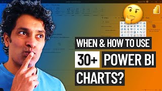
In this video, we explore different types of Power BI visuals. Join Crystal as she shares:
✅How to use popular Power BI visuals like maps, KPIs, cards, matrixes, and many more
✅What the practical use cases are for each type of chart
✅Where to find custom Power BI visuals
✅And how to customize different Power BI visualizations
Jump to the section that interests you the most:
00:00 Intro
00:33 Getting data to report
01:15 Card charts
02:16 Multi-row card
02:59 Table
03:47 Matrix
04:25 Bar & colum charts
05:33 Line chart
06:49 Forecasting with line chart
07:19 Area chart
09:22 Waterfall chart
10:24 Funnel chart
11:09 Scatter chart
12:29 Pie & donut charts
13:21 Treemap chart
14:14 Map charts
15:23 KPI chart
16:33 Other Power BI charts
17:19 Final words
At Coupler.io Academy, we help you make sense of your data. We explain how to use spreadsheets, data warehouses, and BI tools. We share our tips on integrating data between apps and automating data transfers. Be sure to subscribe to our channel so you never miss a thing.
Learn more about Coupler.io and start a free trial at 🔗 https://app.coupler.io/register/sign_up. No credit card is required.
What is Coupler.io?
Coupler.io is a data automation and analytics platform that integrates data transfers from the business apps you use with over 200 available integrations. Over 800,000 users worldwide use Coupler.io to schedule automated data transfers, transform data, and bring it to various available destinations, including Google Sheets, Excel, BigQuery, Looker Studio, Power BI, and more. All available in a simple no-code interface that requires only a 5-minute setup.
See the complete list of the available data sources: https://bit.ly/3OP7in2
For more information, visit:
✅ Our website: https://www.coupler.io/
✅ Help Center: https://help.coupler.io/
✅ Email us: [email protected]
📝 For more information on Facebook Ads reporting and analytics, visit Coupler.io blog https://blog.coupler.io/
🔗 A Guide to Power BI Visuals and to How to Use Them https://blog.coupler.io/power-bi-visu...
🔗 Power BI Tutorial: Analyze Data and Prepare Insightful Reports https://blog.coupler.io/power-bi-tuto...
🔗 18 Best Power BI Dashboard Examples in 2024 https://blog.coupler.io/power-bi-dash...
Keep in touch and join us on social media:
YouTube: @coupleracademy
Twitter: / coupler__io
Facebook: / coupler.io
LinkedIn: / coupler-io
#powerbivisuals
#visualsinpowerbi
#powerbivisualization
#typesofvisualsinpowerbi
#standardpowerbivisuals
#customvisualsinpowerbi
#powerbimaps
#powerbicharts
#powerbikpis
#powerbicards
#powerbitables
#powerbicomparison
#powerbimatrix
#powerbiforecasting
#animatedpowerbivisuals
#powerbivisualswithplayaxis
#powerbidynamiccharts