Published On Feb 18, 2015
Sign up for our Excel webinar, times added weekly: https://www.excelcampus.com/blueprint...
http://www.excelcampus.com/charts/piv...
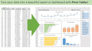
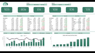
This is part 3 in the series on Pivot Tables and Dashboards. In this video we bring it all together to create the interactive dashboard.
You will learn how to:
- Group dates into months and years to create a time series trend chart.
- Group amounts to create a distribution (histogram) chart.
- Add slicers to your pivot tables and charts to make them interactive.
- Lots of tips and shortcuts for formatting your charts.
You can download the file to follow along at the following link.
http://www.excelcampus.com/charts/piv...
Please subscribe to my free email newsletter to get your tutorials like this and get updated about PivotPal.
Get PivotPal: http://www.excelcampus.com/pivotpal
WATCH PART 1: • Introduction to Pivot Tables, Charts,...
WATCH PART 2: • Introduction to Pivot Tables, Charts,...
Subscribe to my free newsletter: http://www.excelcampus.com/newsletter