Published On Aug 17, 2017
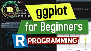
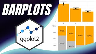
In this webinar, we will provide an introduction to data visualization with the ggplot2 package. The focus of the webinar will be using ggplot2 to analyze your data visually with a specific focus on discovering the underlying signals/patterns of your business.
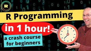
The R programming language is experiencing rapid increases in popularity and wide adoption across industries. This popularity is due, in part, to R’s rich and powerful data visualization capabilities. While tools like Excel, Power BI, and Tableau are often the go-to solutions for data visualizations, none of these tools can compete with R in terms of the sheer breadth of, and control over, crafted data visualizations.
As an example, R’s ggplot2 package provides the R programmer with dozens of print-quality visualizations – where any visualization can be heavily customized with a minimal amount of code.
In this talk attendees will learn how to:
• Craft ggplot visualizations, including customization of rendered output.
• Choose optimal visualizations for the type of data and the nature of the analysis at hand.
• Leverage ggplot2’s powerful segmentation capabilities to achieve “visual drill-in of data”.
• Export ggplot2 visualizations from RStudio for use in documents and presentations.
Repository:
https://code.datasciencedojo.com/data...
Table of Contents:
0:00 Introduction
6:19 Titanic dataset
14:07 ggplot2
27:35 Data analysis
32:45 Factor variables
33:10 Hypothesis data
46:26 Visualization
54:04 Age
56:34 Data visualization
--
At Data Science Dojo, we believe data science is for everyone. Our data science trainings have been attended by more than 10,000 employees from over 2,500 companies globally, including many leaders in tech like Microsoft, Google, and Facebook. For more information please visit: https://hubs.la/Q01Z-13k0
💼 Learn to build LLM-powered apps in just 40 hours with our Large Language Models bootcamp: https://hubs.la/Q01ZZGL-0
💼 Get started in the world of data with our top-rated data science bootcamp: https://hubs.la/Q01ZZDpt0
💼 Master Python for data science, analytics, machine learning, and data engineering: https://hubs.la/Q01ZZD-s0
💼 Explore, analyze, and visualize your data with Power BI desktop: https://hubs.la/Q01ZZF8B0
--
Unleash your data science potential for FREE! Dive into our tutorials, events & courses today!
📚 Learn the essentials of data science and analytics with our data science tutorials: https://hubs.la/Q01ZZJJK0
📚 Stay ahead of the curve with the latest data science content, subscribe to our newsletter now: https://hubs.la/Q01ZZBy10
📚 Connect with other data scientists and AI professionals at our community events: https://hubs.la/Q01ZZLd80
📚 Checkout our free data science courses: https://hubs.la/Q01ZZMcm0
📚 Get your daily dose of data science with our trending blogs: https://hubs.la/Q01ZZMWl0
--
📱 Social media links
Connect with us: / data-science-dojo
Follow us: / datasciencedojo
Keep up with us: / data_science_dojo
Like us: / datasciencedojo
Find us: https://www.threads.net/@data_science...
--
Also, join our communities:
LinkedIn: / 13601597
Twitter: / 1677363761399865344
Facebook: / aiandmachinelearningforeveryone
Vimeo: https://vimeo.com/datasciencedojo
Discord: / discord
_
Want to share your data science knowledge? Boost your profile and share your knowledge with our community: https://hubs.la/Q01ZZNCn0
#datavisualization #rprogramming #ggplot2